In the ever-evolving world of web design and development, one trend has moved from being a nice-to-have to an absolute necessity: mobile-first design. With more than half of global web traffic coming from mobile devices, designing your website with mobile users in mind isn’t just a trend—it’s a critical component of your online success. But what exactly does “mobile-first” mean, and why should you care?
In this blog, we’ll dive into the concept of mobile-first design, why it’s so important, and how you can implement it to create a website that not only looks great on all devices but also delivers a top-notch user experience.
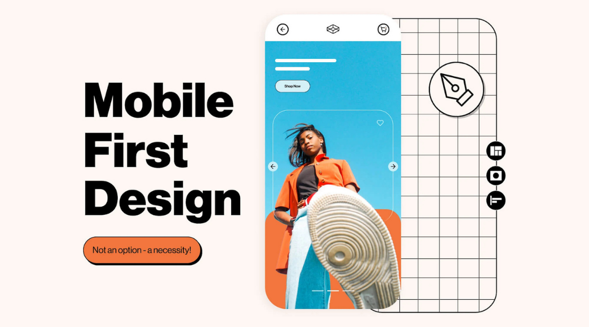
What is Mobile-First Design?
Let’s start with the basics. Mobile-first design is exactly what it sounds like: designing your website primarily for mobile devices before scaling it up for desktop. Traditionally, web designers would start with the desktop version of a site and then adapt it for smaller screens. Mobile-first flips that approach on its head, ensuring that the site is fully optimized for mobile users from the very beginning.
This approach isn’t just about making your website responsive (i.e., ensuring it adjusts to different screen sizes); it’s about prioritizing the mobile experience. In a mobile-first design, the content, features, and layout are all created with the mobile user in mind first, with the desktop experience being a secondary consideration.
Why Mobile-First Design Matters
So, why should you prioritize mobile-first design? Here’s why it’s become a game-changer in web development:
- Mobile Traffic is Dominant: As mentioned earlier, more than half of all web traffic comes from mobile devices. If your website isn’t optimized for mobile, you’re potentially alienating a huge portion of your audience. Mobile-first design ensures that your site is accessible and functional for the majority of users.
- Improved User Experience: Mobile users have different needs and behaviors compared to desktop users. They’re often on the go, looking for quick answers, and using touch interfaces. Mobile-first design prioritizes speed, simplicity, and ease of use, making sure that your users get what they need without frustration.
- Better SEO Performance: Google has shifted to mobile-first indexing, meaning that the mobile version of your website is now the primary version used for indexing and ranking. A mobile-optimized site is more likely to rank higher in search results, which can lead to more traffic and better visibility for your business.
- Faster Load Times: Mobile-first design often results in a leaner, faster website. By focusing on the essentials and stripping away unnecessary elements, you can create a site that loads quickly on mobile devices—a crucial factor, considering that mobile users tend to abandon sites that take more than a few seconds to load.
- Future-Proofing Your Website: The trend towards mobile isn’t going anywhere. As mobile technology continues to evolve, the demand for mobile-friendly websites will only increase. By adopting a mobile-first approach now, you’re setting your site up for long-term success.
How to Implement Mobile-First Design
Ready to make the shift to mobile-first design? Here’s how you can get started:
1. Prioritize Content
When designing for mobile, content is king. Mobile screens are smaller, so you need to focus on delivering the most important information first. This means simplifying your layout, using concise headlines, and making sure that your key messages are front and center. Avoid clutter and keep your design clean and straightforward.
2. Focus on Performance
Mobile users expect fast, seamless experiences. To meet these expectations, optimize your images, minimize the use of heavy scripts, and make sure your website is hosted on a fast server. Use tools like Google’s PageSpeed Insights to check your site’s performance and identify areas for improvement.
3. Optimize Navigation
Navigation is a crucial part of mobile-first design. Your site’s navigation should be intuitive and easy to use on a small screen. Consider using a simple menu icon (often called a “hamburger” menu) that expands to reveal navigation options. Ensure that buttons and links are large enough to be easily tapped with a finger, and avoid requiring users to zoom in to interact with your site.
4. Use Responsive Design Techniques
While mobile-first focuses on the mobile experience, it’s still important to ensure your site looks and works well on all devices. Use responsive design techniques like fluid grids, flexible images, and CSS media queries to adapt your layout based on the user’s screen size. This ensures that your site provides a consistent experience across mobile, tablet, and desktop.
5. Test, Test, Test
Testing is key to a successful mobile-first design. Use a variety of devices and browsers to test your site’s performance and usability. Pay close attention to how your site behaves on different screen sizes and make adjustments as needed. Regular testing helps you catch any issues early and ensures that your site delivers the best possible experience for all users.
The Benefits of Going Mobile-First
Switching to a mobile-first design approach can bring a host of benefits to your website and business:
- Higher Engagement: A mobile-friendly site keeps users engaged, reducing bounce rates and encouraging them to explore more of your content.
- Increased Conversions: By streamlining the mobile experience, you make it easier for users to complete actions like signing up for a newsletter, making a purchase, or contacting your business.
- Competitive Advantage: Many websites are still lagging behind in mobile optimization. By prioritizing mobile-first design, you can gain a competitive edge in your industry.
- Stronger Brand Perception: A well-designed mobile site reflects positively on your brand, showing that you care about your users and are keeping up with the latest trends.
In today’s digital landscape, where mobile reigns supreme, a mobile-first design approach is no longer optional—it’s essential. By putting mobile users at the forefront of your design process, you’ll create a website that’s not only more accessible but also more effective in driving engagement, conversions, and overall success.
If you haven’t yet embraced mobile-first design, now is the time to make the shift. Your users—and your bottom line—will thank you.